10 Things About Human UI that Will Change Forever In Self-Driving Cars
Introduction
I own a car and I drive it nearly every day. Not too long from now the car will be the one driving me.
Future Ken will still own a car, he might operate the car, but the days dedicated to humans driving are numbered.
It’s going to feel very different being a passenger in the driver’s seat!
Thinking About Our Future
I’m a product engineer. I’ve written a lot of software that people use. How do I know what to build? I use design-thinking. It allows me to figure out what problems people have, and then determine how to solve them.
One day I thought, “I should apply design-thinking to the experience of driving a car!”
I was very keen to reconsider everything I assume about cars. I wondered if the user interface is broken. Does it need to be better? Ultimately it’s a question of how will we interact differently with cars in the future? What user interface (UI) controls can vanish? Are we going to miss them, or is it good riddance?
Read on, and discover my predictions for how the user interface changes when I become a passenger in a car that drives itself.
1. Turning off Signals
Headlamps, turn indicators, and brake lights are completely unnecessary. They signal intended movement choices between human drivers.
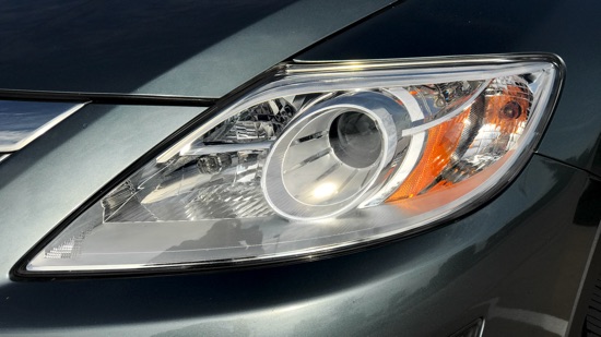
There’s no reason having signal lights when computers control cars. They’re antiquated leftovers from obsolete biological visual systems (aka “eyeballs.”)
2. Love An Extra Glovebox
There’s no need for a space-hogging steering wheel in a self-driving car. Get rid of it! Reclaim all of that space as storage for the primary operator. Keep all the snacks and sun-glasses you want!
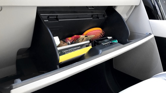
Scratch that. Give me a shelf for my laptop. Offer a power connection. Activate wifi. Turn the car into the ultimate docking station for my laptop/tablet/phone.
3. Treating Windows
Windows are a traditional, vital, user interface. Unobstructed views allow human drivers to see where they’re going. We won’t be needing those anymore.
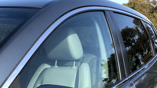
Decorate your windows! Your living room has shades, curtains, or shutters. Bring that personal style into cars. Make the windows stained glass and beautiful!
Do we even need big sheets of glass surrounding the car? Let’s make them touch-screens instead.
4. Gauging Interest
Speed, RPMs, engine heat, and other dashboard gauges are obsolete when people stop driving. Figure out what’s useful to human riders. Show more of that!
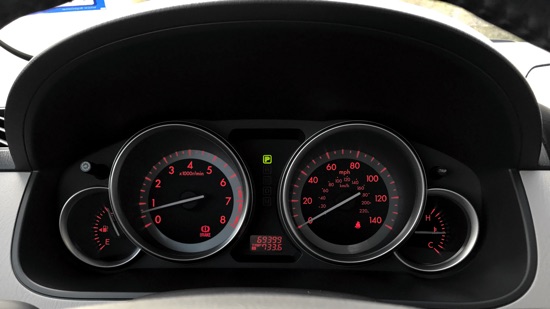
Actionable info: “Are we there yet?”, “Does my car need a charge?”, “What’s interesting nearby?” Lead with a consumer-grade user experience!
5. Car Seating
Power seats contribute to a fantastic UX. They have deep configuration for your comfort. Move forward and backward, tilt up and down, and adjust the angle.
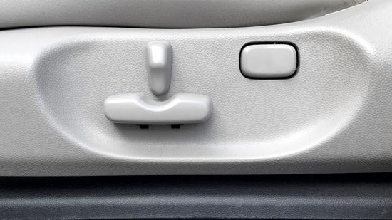
Include turning the seat clockwise. When I’m in “the driver’s seat” of a self-driving car I want to spin around. Then I can fully engage passengers in the backseat.
Human-centered design for the win!
6. Controlling Stalks
Stalks. Two arms sticking out of the steering wheel. They lift up and drop down. Pull forward and push backward. Ends turn around. Always partially obstructed, and at times totally out of view. Littered by icons requiring interpretation, and small text demanding concentration.
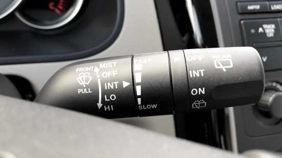
UI overload! UX fail! Get rid of stalks. We’ll never miss the dozen horrible micro-interactions.
7. Holding the Cup
Water, coffee, sodas – we drink plenty sitting in cars. You can never have too many cup holders. Most cars have a few low in the center. Where they can’t be a distraction.
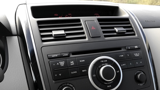
Raise them up. Feature them. Right at eye level within reach. Fit a lot more than just a cup: electric razor, cellphone, eye liner, toothbrush. Stuff we want!
8. Unsticking the Gear Stick
I owned a 350Z. It was manual and shifting through its gears was a blast. Eventually I traded it in for an automatic. Why in the world does it have a gear stick?
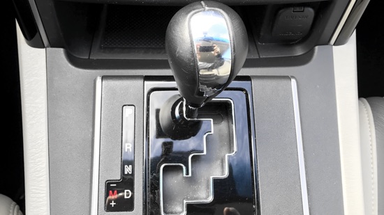
Exchange the stick for two buttons. One labeled “forward”, and one labeled “backward.” Let it go into park when I stop and turn off the car.
9. Considering the Center
You’ll find a floor-mounted console between the front seats. It serves to divide driver and passenger while providing modest storage.
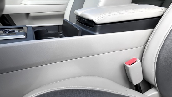
Rip it out! I want the space back when my car drives itself. I’ll gain leg room so I can swivel around and talk to people riding in the back seat.
10. Chasing that Feeling
We’re in a car culture. People grow up with them, buy them, customize, and name them. Saying goodbye to human-driven automobiles will be difficult.

Gear-heads might get their need for speed at private driving reserves. Members-only clubs could offer the thrill of old-school driving: dirt bikes, ATVs, Jeeps, snowmobiles. Open-air and dangerous? Yes please!
Some Random Ideas
- What will we call the next generation of cars? Automobiles! They’ll continue being mobile, and even more automatic.
- Ages for operating self-driving cars will open up. Children as young as eight, and seniors well past retirement, can navigate a clean computer interface.
- Humans traveling in self-driving cars will choose touch screen over voice control. Passengers want to talk with one another, listen to music, or silently work.
- Your self-driving car will pick you up curbside and that’s fantastic. How to recognize it from all the others? Design it! Choose its color and style matching your personality.
Cars Need a Revolution for Humans
Cars have become complicated. Almost to the point of being impossible to truly understand and effectively master.
It didn’t happen all at once, and it didn’t happen with any malicious intent. We know cars started with a simple user interface. New drivers trained on that and learned it well.
Every few years a new control was added and human drivers mixed that into their on-going knowledge of the machine. Users evolved with the interface. Industry presented these as minor incremental changes.
Take a moment an imagine begin a beginner driver today.
Take a serious look at all of the controls. Mindfully consider all of the data reported by the car. Mix in erratic traffic patterns. Road signs. Wandering human attention. Distractions from cellphones. Demands of modern life. Complexity abounds!
It’s amazing that people safely get to their daily destinations driving cars. Moreover, it’s a wonder people want to try.
Recommendation
It’s going to feel very different being a passenger in the driver’s seat! Ultimately I think self-driving cars are an improvement for humans.
What do you think about self-driving cars? Are auto UIs too complicated? Do they need radical simplification? Tell me how human UI will change when self-driving cars become practical. Should we invent these new machines? Should we demand them?
Reach out to me on Twitter. Let’s do something awesome together!


